You thought picking a neutral would be a cake walk, but curiously you find yourself staring at a purple wall, when you are sure you bought a gray. Perhaps you are questioning why this is when neutrals are the recommended, no fail, go with anything and everything colors. Here is a little insight to why neutrals can be fickle and some tricks for zeroing on the right ones for your home.
I’m going to deliver some truths here, so brace yourself. I’m sorry to break it to you, but you’ve been lied to all this time regarding neutrals.
Neutral truth 1: Neutrals are not simple, in any respect.
Neutrals are exceptionally complex colors that belong to color families. They are colors that have been mixed, muddied and toned down to the point where they can appear to have no color. The more colors we mix into a color the lower the chroma, and the more complex it becomes.
Take a look at the chroma scale below:

A color’s chroma is how bright or intense it is. High chroma colors are what we would consider clean, bright and free of any kind of muddying. Low chroma colors are the opposite; they are not clean or pure and what we consider neutrals or neutralized colors. Low chroma colors can be muddied to the point they are difficult to discern for what they are. Recognizing their color family takes a little practice in undertone identification.
Neutral Truth 2: Neutrals can be warm or cool
All six color families have neutrals. The neutrals of each family will retain thier color family attributes, though with diminished impact. Cool color families (green, blue, purple) will have cool toned neutrals with cool color properties. Warm color families (red, orange, yellow) will have warm toned neutrals with warm color properties.
Let’s compare a blue and red chroma scale,

and take a closer look at the two on the end.

The red family neutral, left, feels warmer than the blue neutral on the right. A big step in the right direction for selecting neutrals is to acknowledge this and chose a neutral as you would a higher chroma color. For example, you want a neutral wall color, but you’d prefer a cozier feel over a spacious one. If you were selecting a higher chroma color you might select an orange or yellow color to suit this need. The best place to select neutrals then would be from the yellow or orange family.
What about gray? Grays are achromatic right?
Neutral Truth 3: Grays are not achromatic
Colors can be so muted, washed out and neutralized that they don’t register as colors remember? When a color reaches that point, we call it a gray. True, achromatic gray is the end of the road for the chroma of a color, and a last point that all color families will share. However, before you reach that point, there are thousands of grayed colors.
I’ve pulled some examples of grays from each color family for comparison.
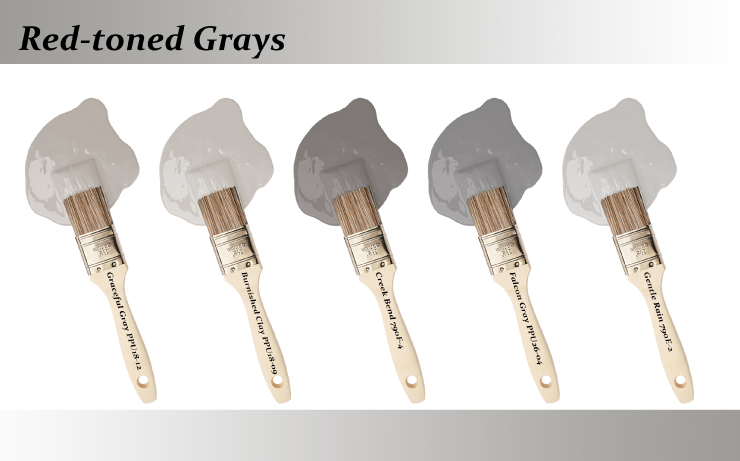
Greaceful Gray PPU18-12, Burnished Clay PPU18-09, Creek Bend 790F-4, Falcon Gray PPU26-04, Gentle Rain 790E-2
Red toned grays feel very complex. Some lighting can make theses grays appear as mauves or to have a subtle pink tint.
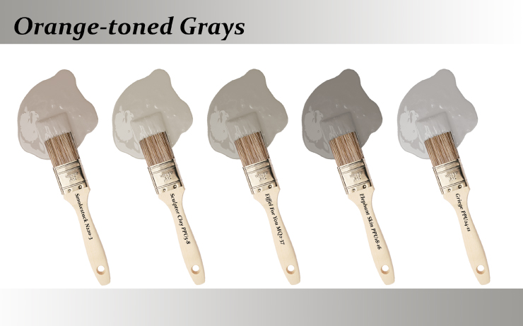
Smokestack N220-3, Sculptor Clay PPU5-8, Eiffel For You MQ2-37, Elephant Skin PPU18-16, Griege PPU24-11
Orange toned neutrals make up the greige (beige + gray), and taupe families. These tones, in warmer lighting conditions, can appear as browns.
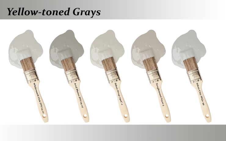
Whitewash Oak PPU24-12, Arid Plains PPU25-07, Silver Drop 790C-2, Tanglewood N320-3, Silver City MQ2-59
The yellow family is, by far, the most forgiving and versatile as far as grays go. In warm lighting conditions these grays can appear like tans or off whites.
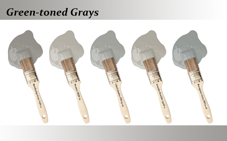
Battleship Gray N360-4, Pumice MQ6-23, Old Celadon PPU25-05, Granite Boulder 790D-4, Brampton Gray PPU11-16
These grays can appear as sages or spruces depending on the temperature of the lighting. Green undertoned grays are popular choices for exterior use.
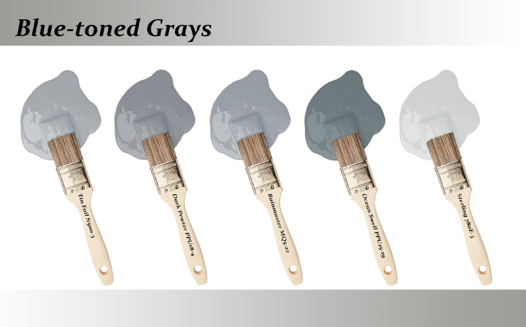
Tin Foil N500-3, Dark Pewter PPU18-4, Rainmaster MQ5-22, Ocean Swell PPU25-19, Sterling 780E-3
These tones will impart a cooler feel to a room and can appear blue in darker conditions. Like the green family, blue toned grays are popular choices for exteriors.
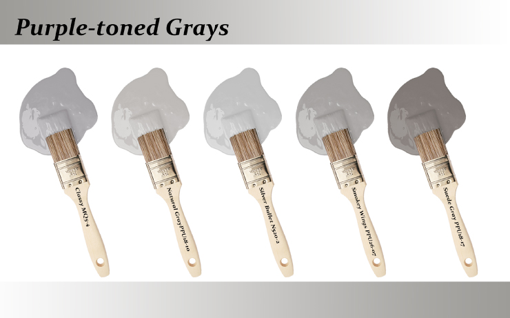
Classy MQ5-4, Natural Gray PPU18-10, Silver Bullet N520-2, Smokey Wings PPU26-07, Suede Gray PPU18-17
Purple undertoned hues are probably the most challenging of the gray tones. Not only can it be difficult to recognize the undertone, but their murky, complex nature reveals itself in a color that changes its appearance throughout the day.
Neutral Truth 4: Lighting will make or break your neutral
The color complexity of neutrals means they are very susceptible to the influence of lighting. Light is color, and different sources of lighting, natural or artificial, will effect how the neutrals appear.
Take this light gray room with standard midday light.
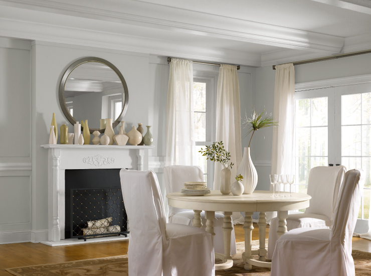
In the early morning with the bright warm morning sun it might look more like this:
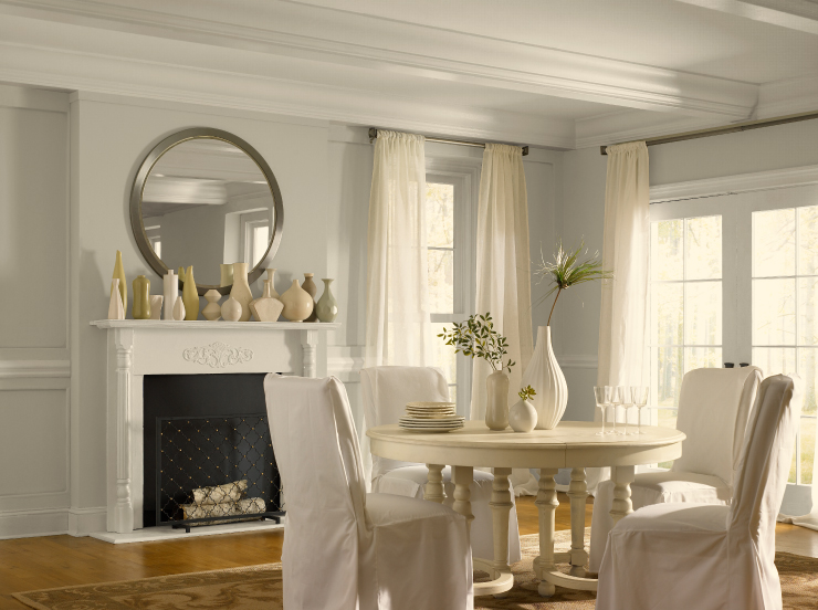
In a home with the blue light of a north facing window it might look like this:
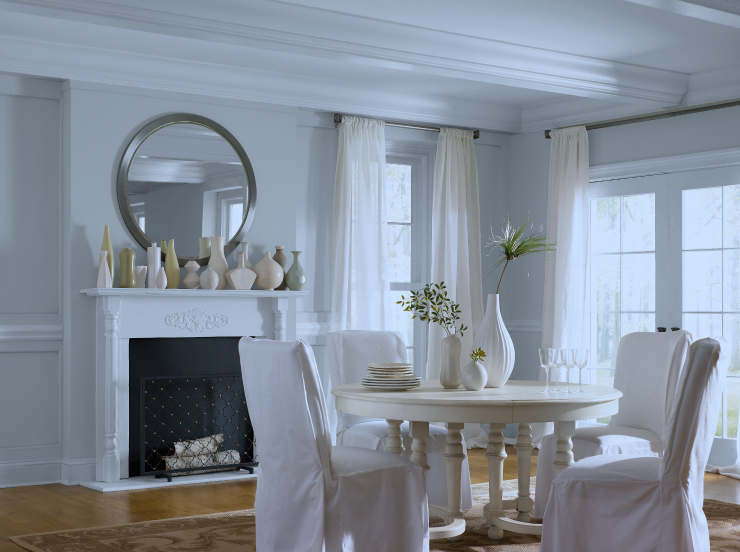
The only thing that has changed in the room is the light temperature. You can see now how the perceived wall color is dependent on the light source.
You should have an idea now why the color you selected may appear so different than what you thought you picked out. Let’s review some of the key takeaways about neutrals to help you choose the perfect shade for your home.
#1.) Neutrals retain the color attributes of their parent families, just on a softer scale. For example yellow based neutrals will impart a warm feeling, blue based neutrals a cool feeling.
#2.) Neutrals have more color nuance than brighter, clean shades. You’ll want to pay close attention to undertone when selecting shades.
#3.) Lighting plays a huge role in the perception of colors, and neutrals are particularly sensitive. Be sure to test your color in your space to see how it will appear throughout the day.
We strongly recommend sampling colors on your walls before committing to a color. This is especially true for neutrals whose appearance can be quite transitional throughout the day.
For more information, ideas, and inspiration on color visit our Color Studio at behr.com. Our Paint Your Place tool is a great starting point for exploring, comparing and contrasting color within your own space.
Colorfully yours,
Quinn

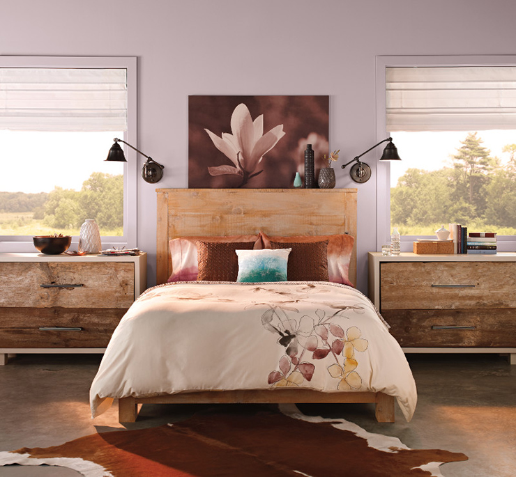

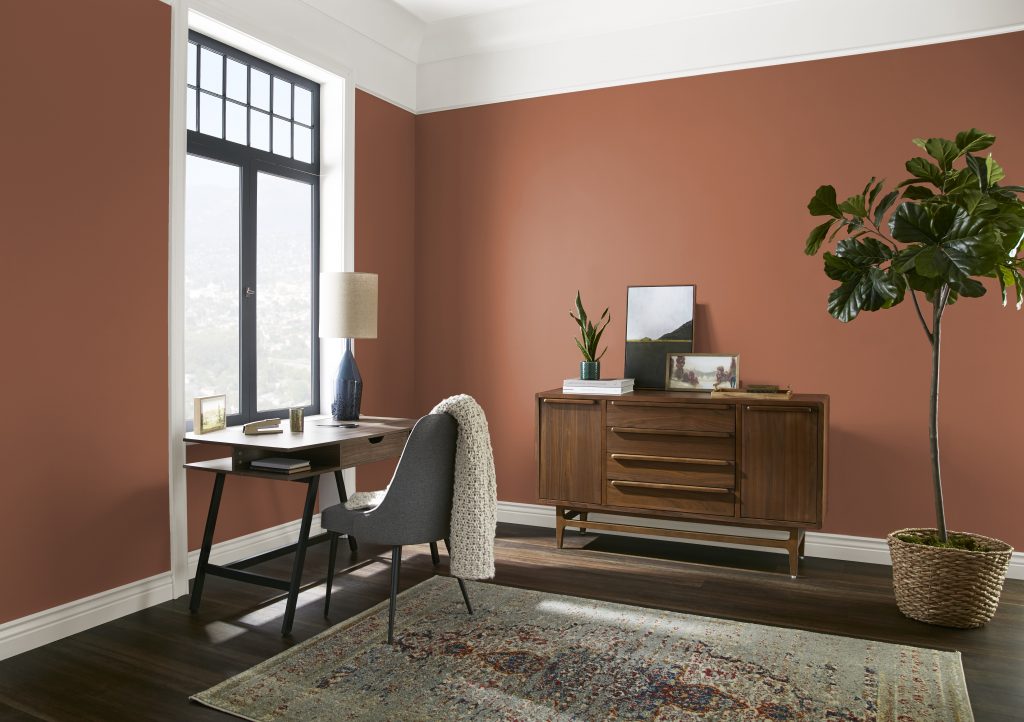
Paited our walls Cameo White. Floors are Lifeproof Ashland Valley. Not sure on what trim and baseboard color should be. Looking at Graceful Gray?
Hello Kim, thank you for reaching out!
Graceful Gray is a perfect choice fo your trim and baseboards to pair with Cameo White.
Hope this helps!
Colorfully Yours,
Deanna
Hello! Please point me in the right direction for a grayish color for a modern farmhouse look. Or maybe i dont need to go with gray? I have no clue where to start lol! Currently have contractor grade flat walls in sherwin williams “worldly gray” but im looking to switch it up a bit. Kitchen is all white.
Hello Michelle, thank you for reaching out!
You can go with a gray or a soothing blue-green farmhouse tone.
Here are a few recommendations that will coordinate with your furnishings.
Classic Silver PPU18-11, Riverdale N410-3, Zen PPU11-14, or Sonic Silver HDC-MD-26.
Hope this helps!
Colorfully Yours,
Deanna