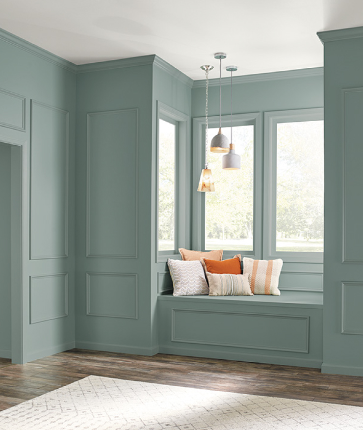
Behr Paint is proud to introduce you to In The Moment, our 2018 Color of the Year. A soothing, restorative coalescence of blue, gray and green, In The Moment’s calming effect and nature-inspired beauty made it the ideal choice as Behr’s first-ever color of the year.
The name says it all. In The Moment is a fresh, comfortable shade that evokes a sense of sanctuary and relaxation—a colorful countermeasure for our busy, always-on lifestyle. In name and color, this shade reflects our society’s desire to disconnect, recharge and be present in the here and now.
October is In The Moment’s moment. As fall begins its slow drift into winter, homeowners tend to turn their focus from exterior beautification to the painting and DIY projects that enhance their homes’ interiors. To support those efforts, Behr wants to provide access to the colors that will define 2018 so they can be incorporated in those projects. And In The Moment is leading that charge into the new year.
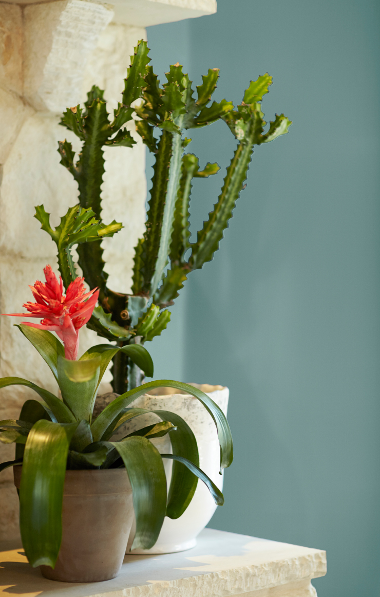
Why ‘In The Moment’?
If you’re looking for a new paint color, chances are it’s because you’re interested in altering the mood in a given room. To that end, Behr’s 2018 Color Trends palette is comprised of shades designed to enhance the energy of your most meaningful spaces—to help you create an environment where you feel free to kick your shoes off, take a deep breath, and just be.
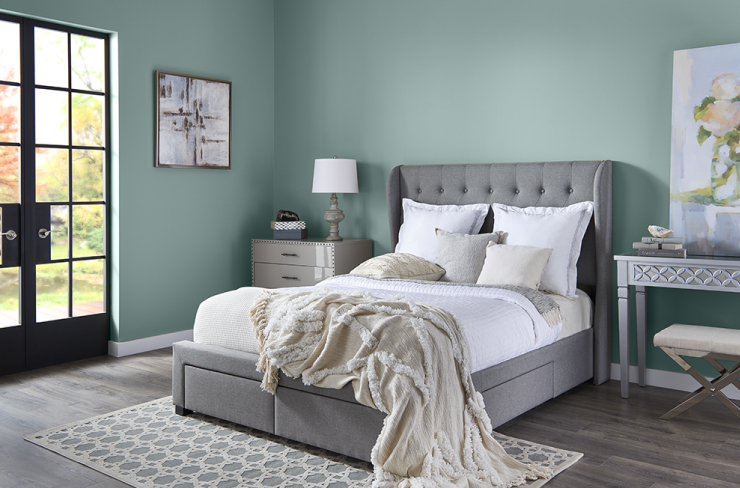
In fact, the entirety of our 2018 Color Trends is designed to help you manifest peace and calm in your home. We were specifically drawn to lifestyle trends like awareness, mindful living, and the Danish concept of hygee, which conveys the feelings of coziness, comfort, cheerfulness and well-being. More simply, our world is looking for an escape from the technology and material possessions that clutter our thoughts, minds and homes. We seek balance and joyful experiences.
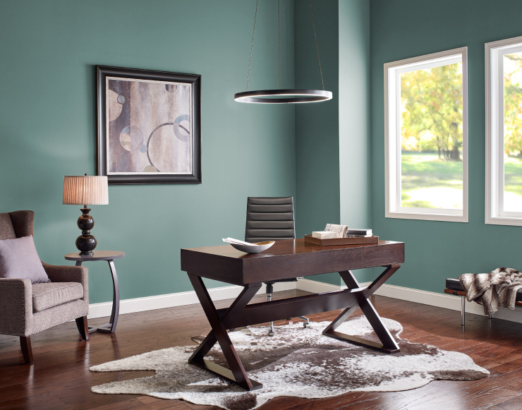
A Personal Connection to Color
Yet while we will certainly tip our caps to concepts of color therapy and mindfulness, they do not define our mission. Living in the moment is not about hitching one’s wagon to a large-scale movement or thought pattern; it’s about developing a personal relationship with color that speaks to you: the individual. It’s about doing what you must to make yourself feel at peace and in balance.
Where Will We Find This Color?
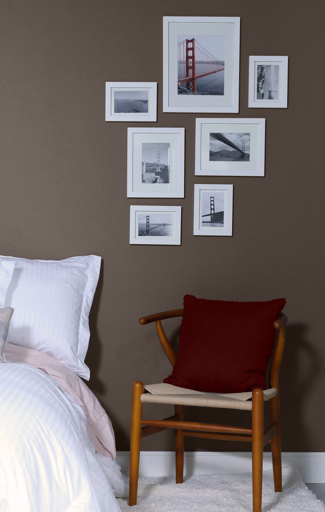
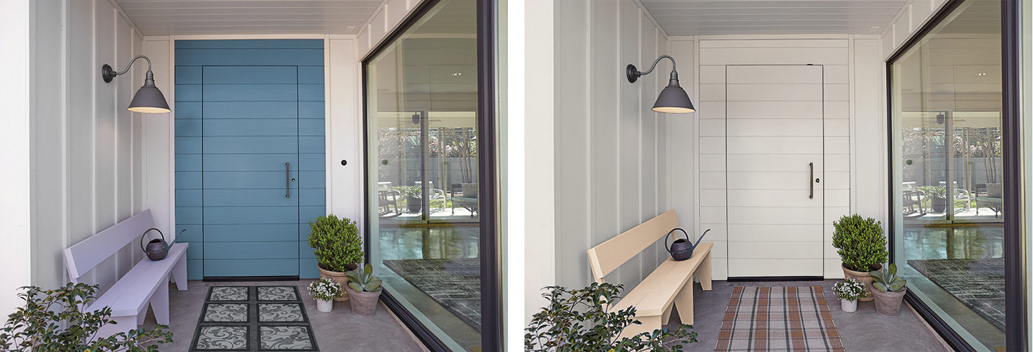
With its soft presence and versatile nature, In The Moment is easily incorporated into existing color schemes. For that reason, we expect this hue to have a big impact in the worlds of fashion, interior and exterior design. We’ve seen the use of this color, by trend setting designers, not just on walls, but in the textiles and patterns of decor and furnishings, accenting cabinetry, and even gracing kitchens and dining rooms with elegant tableware. The earthborn nature of this shade will show it to be a popular choice for exteriors. It’s alpine or desert sage ambiguity allows it to transcend both style and region.
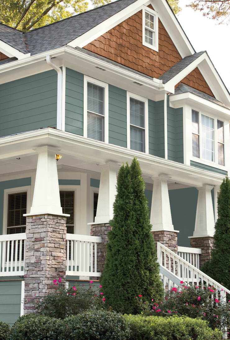
To learn more about this color and our complete collection of 2018 trend colors visit our article on Behr.com.
Colorfully yours,
Daniel Evans


Love this colour! Going from pale green in living room and hallway. Subtle but
warm. What do you think?
Marilyn – In the Moment is definitely one of our favorite colors and we do think it would be a great option for a living room and hallway.
Colorfully yours,
Diana
Thoughts on 3 walls wheat bread and wall with lathe stone fireplace painted with in the moment?
Hi Joyce,
I think your color options will look really nice. I suggest you try a color sample before you commit as the lighting, time of day and other items in the room may affect the color appearance.
colorfully yours,
Larayne