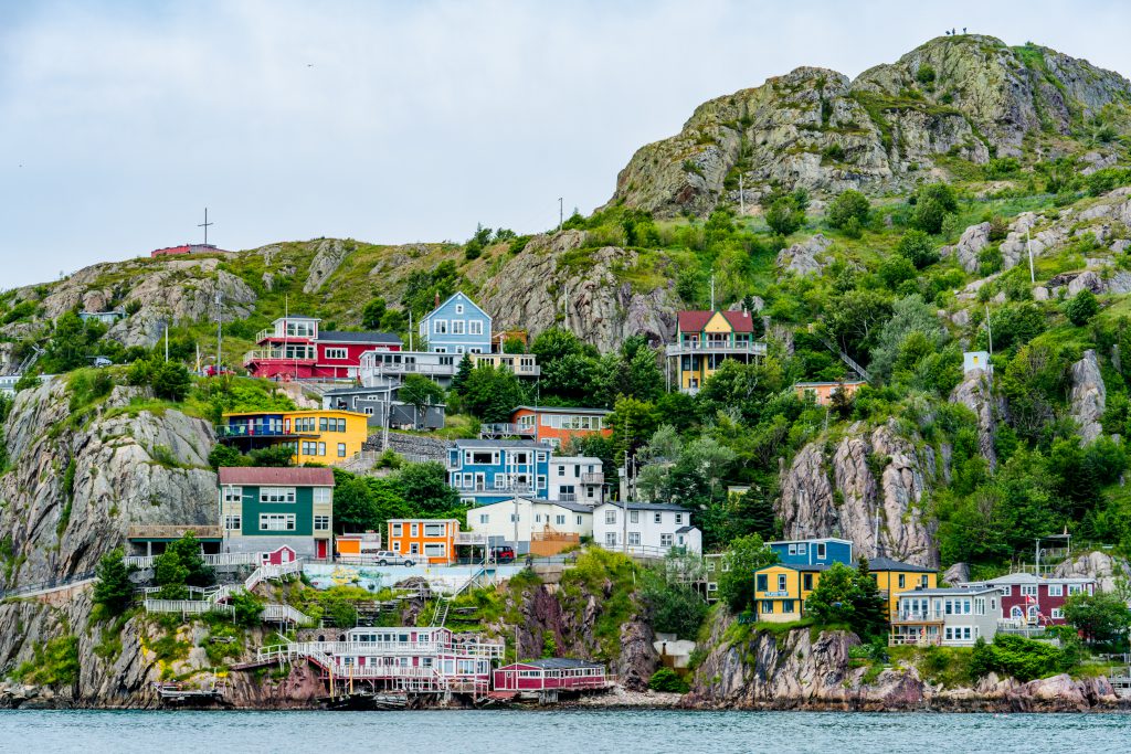
As the first stop on my Color Explorer journey, I had an inkling that St. John’s, Newfoundland might just be the best-kept color secret in North America. The spattering of photos I could find of it seemed to suggest as much, anyhow. A first step out of the airport confirmed my chromatic preconceptions. St. John’s is a true color mecca, and while “Newfs” don’t take themselves too seriously, when it comes to paint, they don’t mess around.
Less than an hour after arriving at my hotel, I was picked up for a guided half-day tour of the city. The rainbow row houses of St. John’s immediately jolted me with a surge of energy (the giant coffee helped too). The houses aren’t just colorful; they make a statement. As I learned more about the history of Newfoundland and the population of St. John’s, that statement became more and more clear.
St. John’s is the Easternmost city of North America. It’s mostly forgotten and often ignored. It boasts no industry besides fishing. The weather is notoriously fickle and harsh. And yet locals are not only extremely amicable but also proud of their city and heritage. Circumstances and geography have made them fiercely independent and resilient. Their hilarious slang was developed over time as a way to communicate concisely on the water. “Newfs” are quirky folks, indeed. It only makes sense that their homes reflect their distinct personalities.
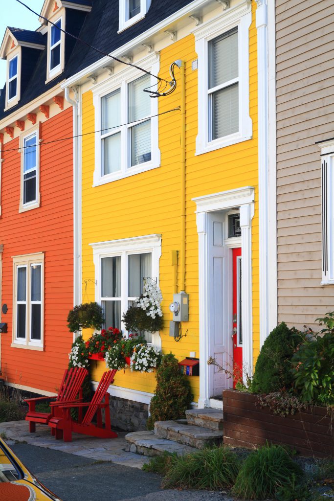
And reflect they do! Jellybean Row comprises an entire neighborhood painted in richly varied hues–a real estate kaleidoscope. The longer I spent roaming the streets, studying the pigment choices, the more I came to appreciate the complex harmony of the St. John’s palette. Somehow, despite the sheer diversity of colors, the facades didn’t clash. There was an unspoken synergy among neighbors. The color of the door on one house was a variation of the primary color on the neighboring house. Entire blocks seemed to have strategized together. Everyone was free to pick whatever color they preferred but the degree of saturation stayed uniform. And if a house abided by no color laws and chose some neon orange or electric yellow concoction, it still, as if by magic, managed to fit in.
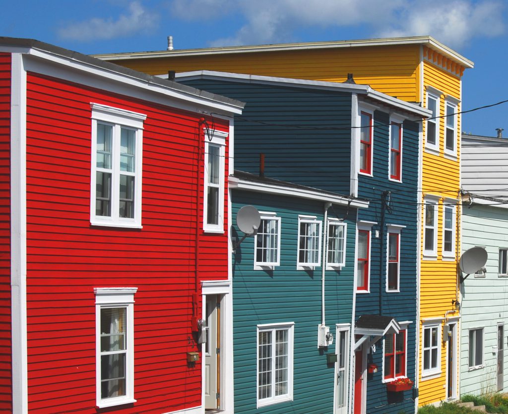
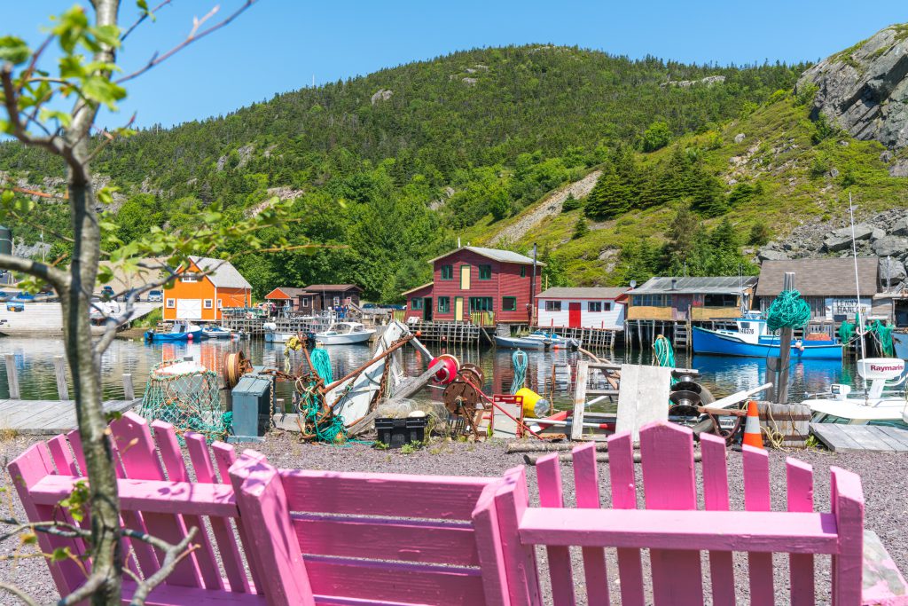
It wasn’t just the homes that were colorful. It was the details, too. Suspended flower pots accentuated primary pairings with pops of purple and grenadine pink. Exploring Quidi Vidi, St. John’s’ charming backdoor battery, and the southside docks at the mouth of the port, I realized that not all bold color choices were intentional. The weather-worn ropes, beat-up shipping containers, faded fishing nets, and rusty anchors all conspired to evoke a Wes Anderson-esque, nautical-themed color utopia.

Imagine being out at sea in the middle of a brutal Newfy winter and steering your vessel back to the shipyard. Wouldn’t you appreciate a cheerful mooring? Wouldn’t you want the cleats on you dock to be tangerine-tinted too?
Colorfully Yours,
David Axelrod
Follow my BEHR color explorer journey on Intragram@2straws

