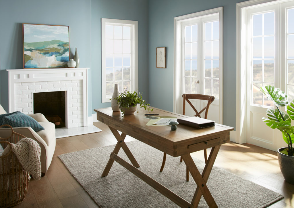
With so many people working remotely or on hybrid schedules, the home office has become an important room in the house. Work areas have been thoughtfully carved out of living rooms, kitchen nooks, attics, basements, spare rooms, closets and even garages. Regardless of size or location, a considerable amount of time is spent in this room each day. Productivity is the #1 consideration for a successful workspace and color plays a role in achieving that.
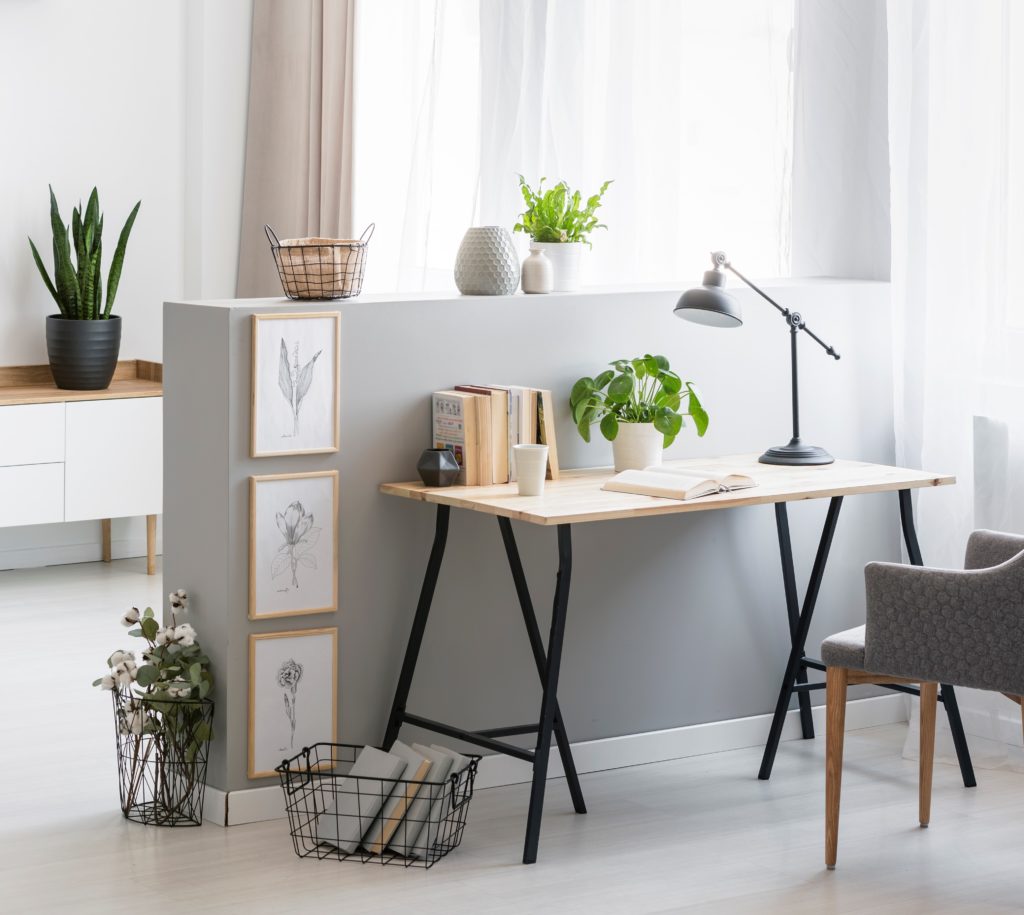
When choosing color for your home office, consider the types of activities that take place there. How does the room need to feel for you to do your best work? Do you need to sit quietly and focus, or will you take calls and join video conferences? Will you need to move around the room or have tables available to spread out projects. Is this your private workplace, or do you share the area with other family members?
Proper lighting is a must: natural light from a window helps keep energy levels at their peak. Task lighting can also keep eyes from becoming fatigued if they focus on small details for a long time. Color also looks better in well-lit rooms!
Let’s take a look at how color can impact your working style:
White is a great color for small spaces to help areas feel larger and more open.
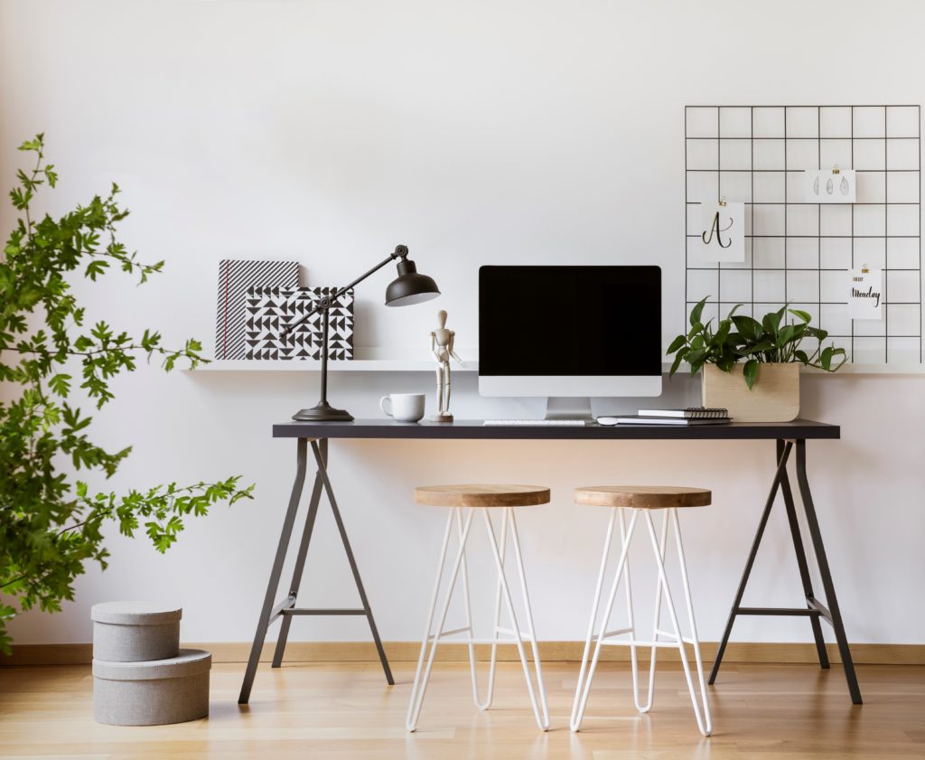
Gray is a color that feels balanced, does not distract and easily coordinates with other office furniture or colorful accessories.
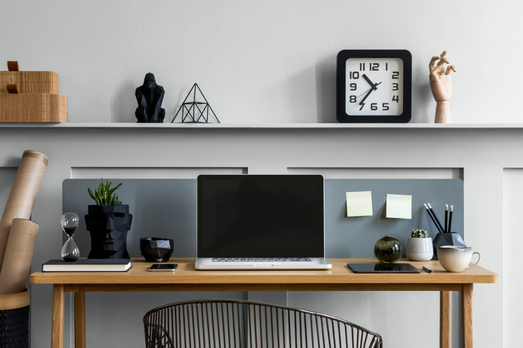
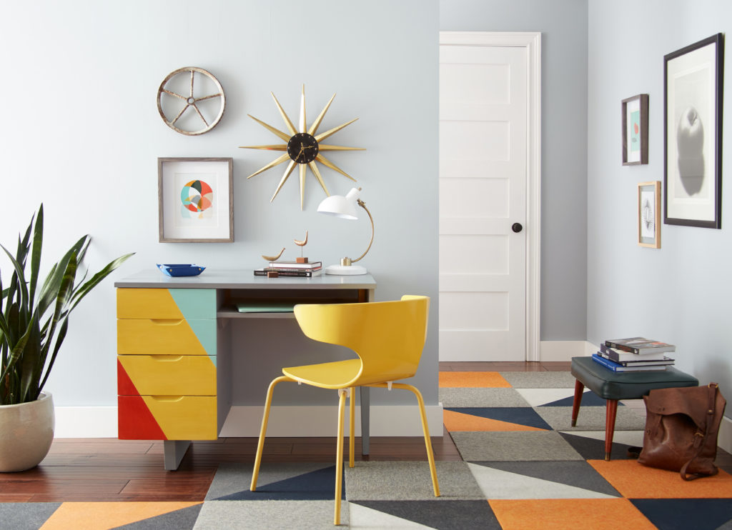
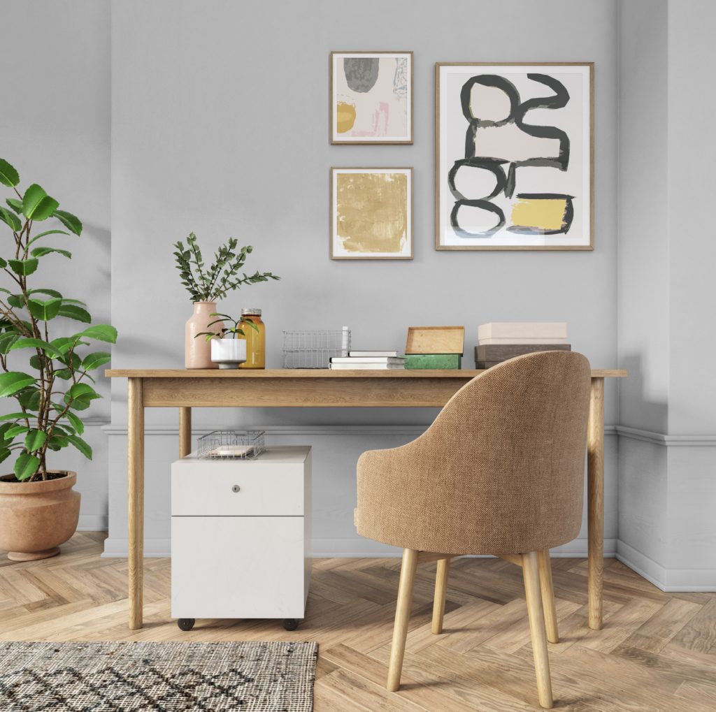
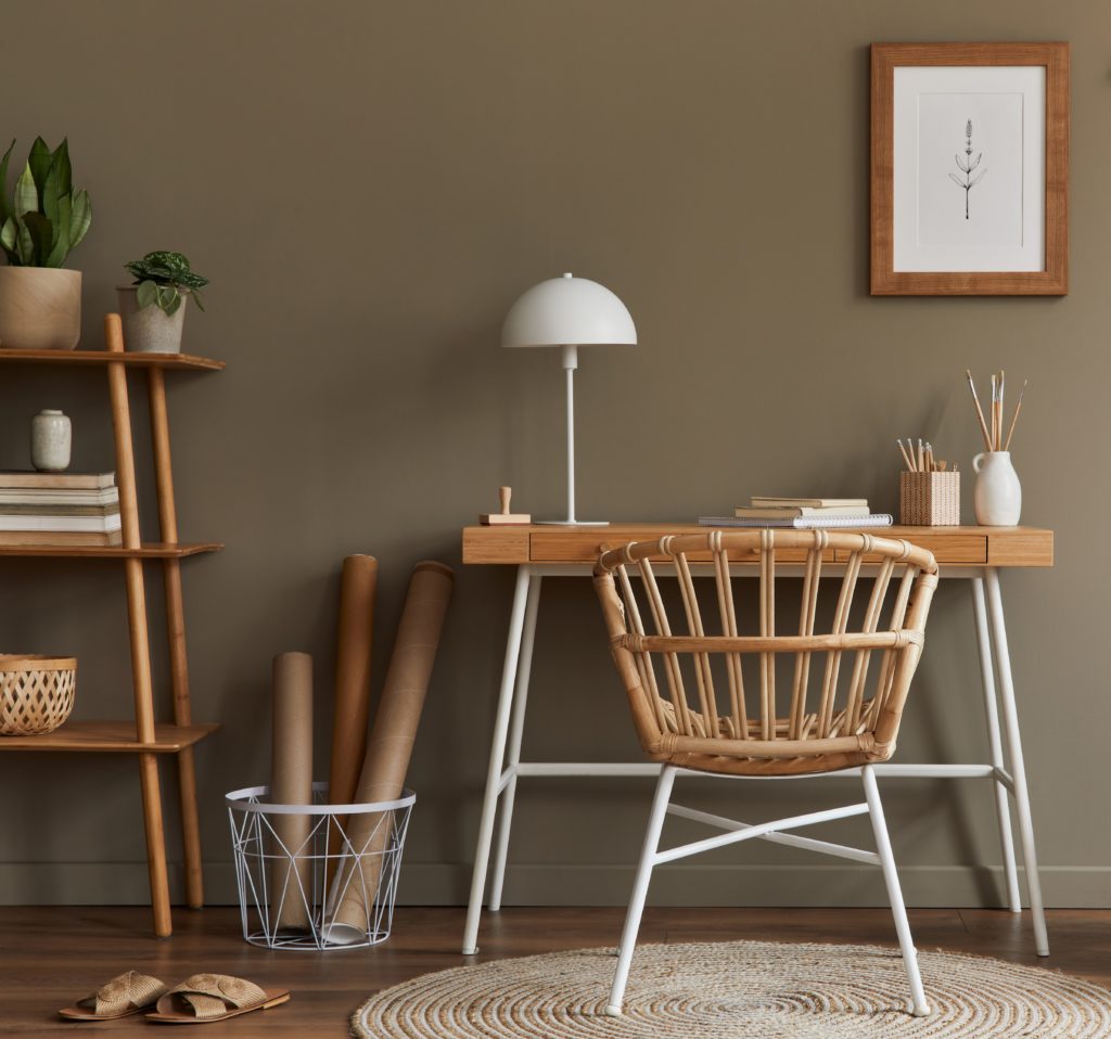
When the need to focus is essential, neutrals create a non-distracting background. Try using warm shades of brown, taupe or sand keep walls from feeling ho-hum dreary.
Blue is a tranquil color. Lighter blues have positive associations for clear thinking.
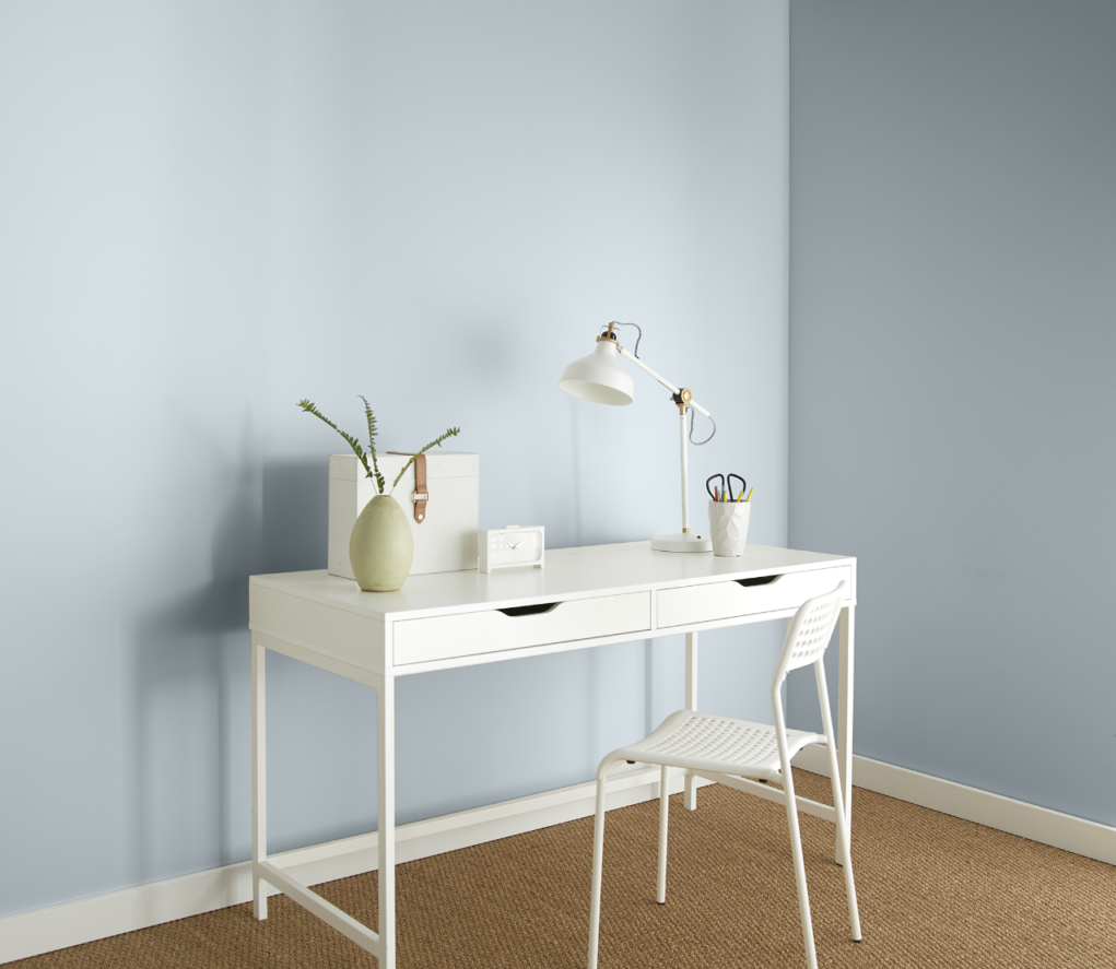
Darker Blues are known for creating an atmosphere of stability.
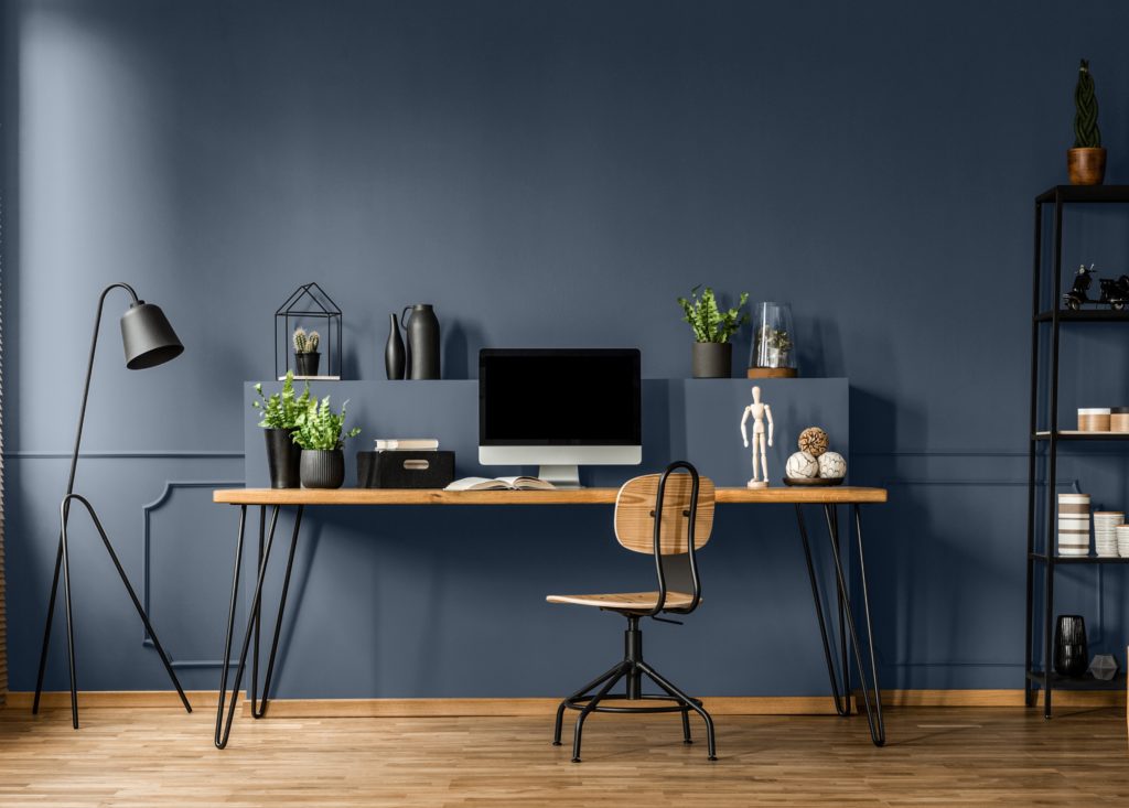
Aqua and turquoise offices have a peaceful balance of blue and green and are easy to live with and helps with focus.
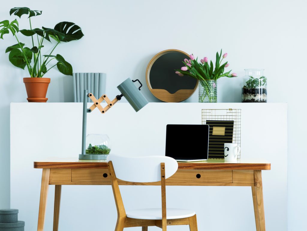
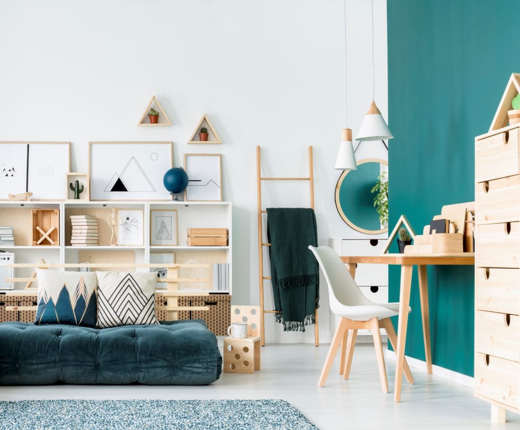
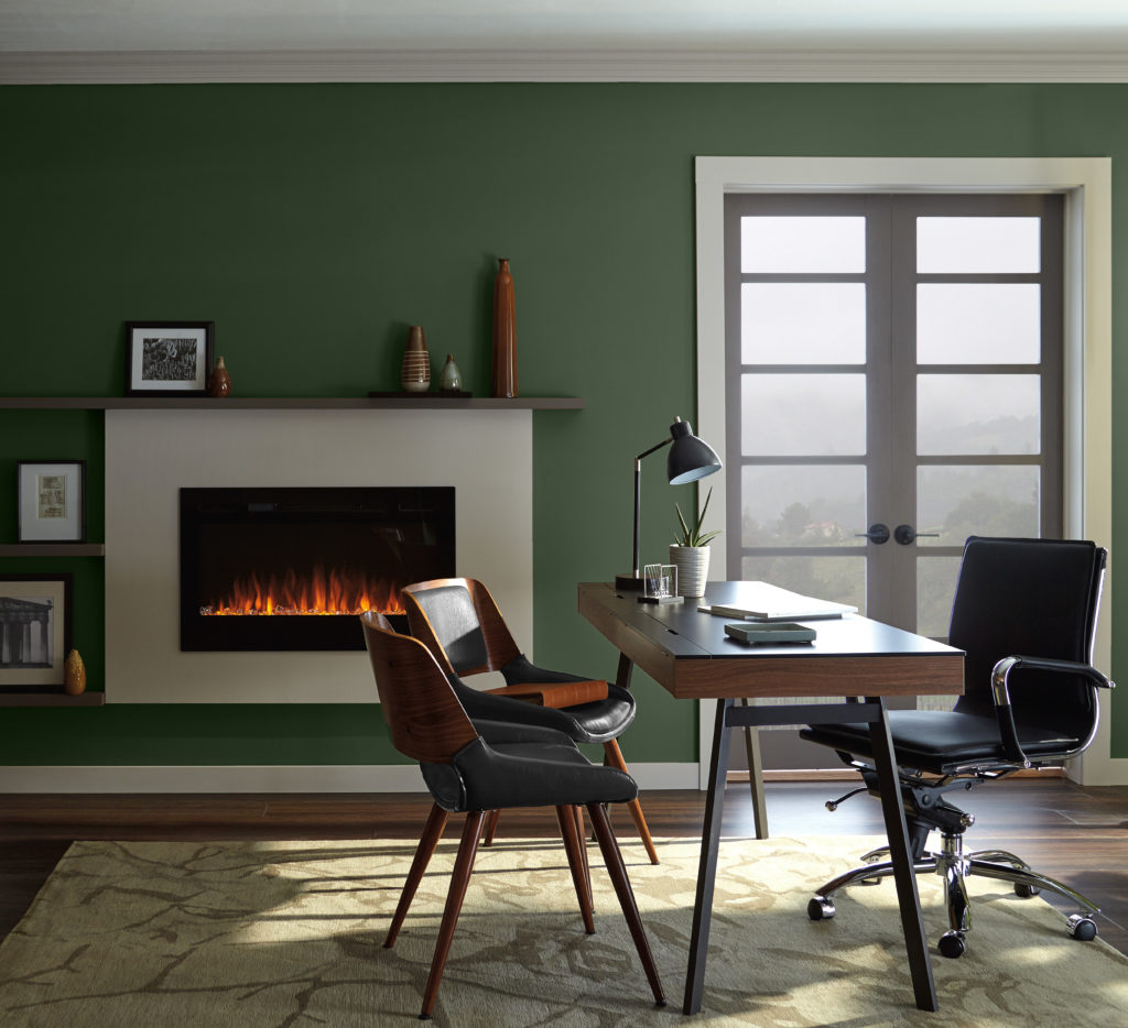
Natural and calming green are great for people working long hours and does not fatigue the eyes.
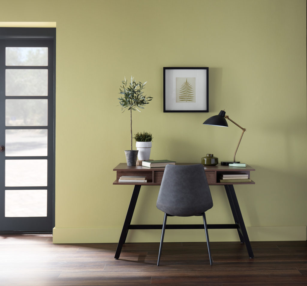
Dark Greens create boldness and balance in where concentration and focus is needed.
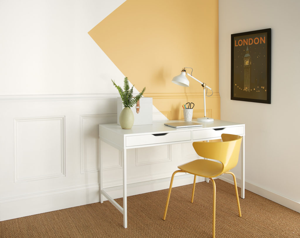
Yellow is associated with optimism and helps stimulate creativity. This is a great color for designers to have in their space.
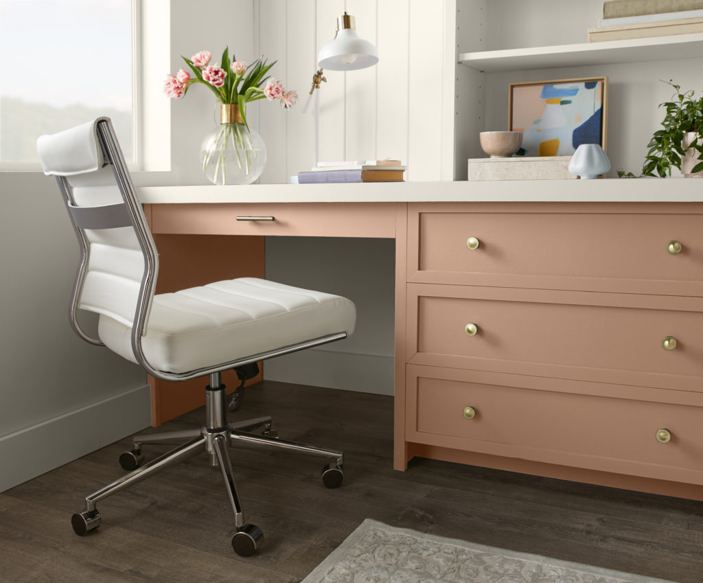
Terra cotta tones provide a sense a warmth to all white space and can suit a variety of home office styles.
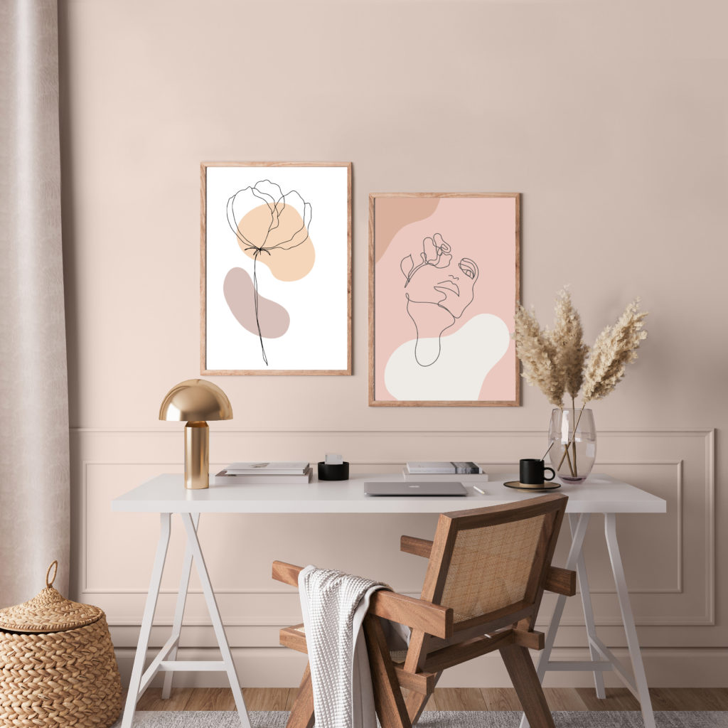
For a room that feels less serious, pink is a color that adds an element of charm and playfulness in an office.
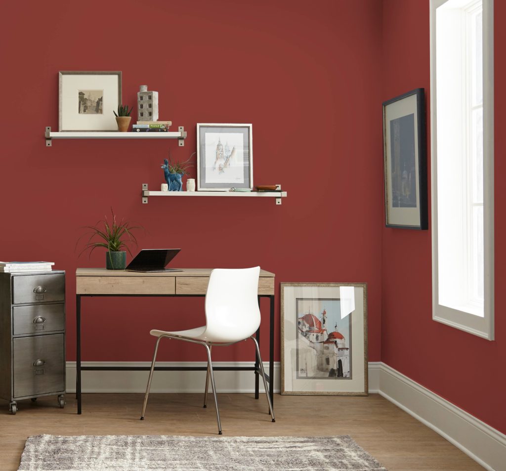
Red is a high energy color – great for rooms where there are lots of conversations or activities taking place.
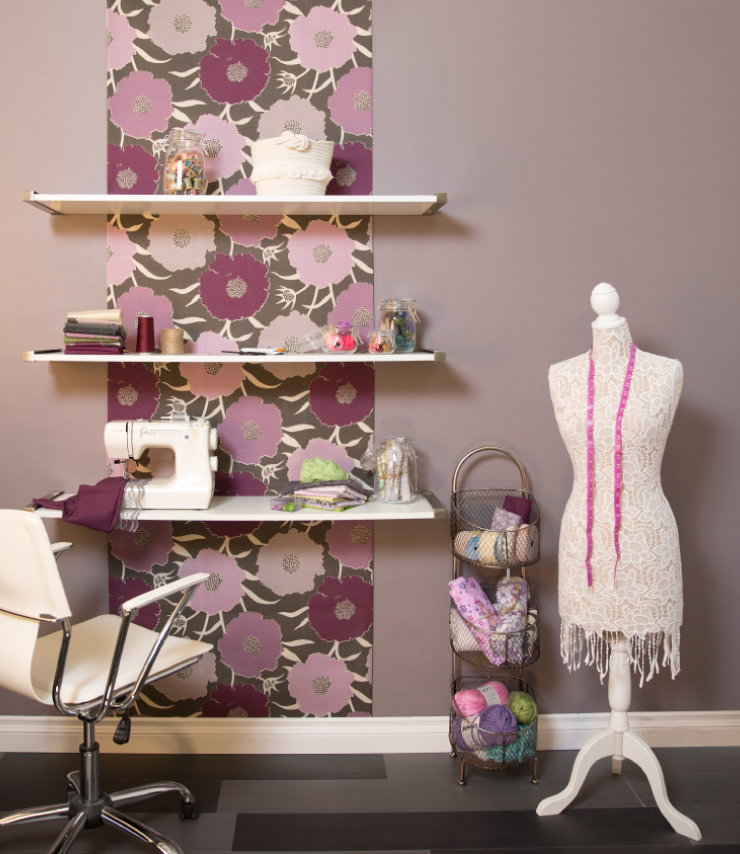
When projects call for out-of-the-box thinking, purple is known to stimulate creativity making it terrific for studios or craft areas.
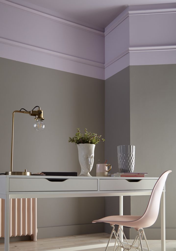
Lastly, your home office can be professional, but still feel personal. Show off family photos, favorite pieces of art, book collections and make sure your favorite coffee cup is always nearby!
Colorfully yours,
Erika


What is the wall color of the very first blue office picture? No color is listed. It’s also the cover pic on a behr brochure and the color is not listed anywhere there either.
Hello Sabrina, thank you for visiting our blog!
That office color is Half Sea Fog N470-3.
Colorfully Yours,
Deanna
Do you have pictures of walls using two colors
Hello Rosie, thank you for visiting our blog!
We do have options for accent wall color and painting the remaining walls in a different color. Is that what you referring to?
Colorfully Yours,
Deanna