Choosing paint colors for your home can be both exciting and intimidating. Often, we choose the safe path, embracing the calm and versatility that a neutral hue provides. However, making a statement with a bold color can add a boost of fun and energy to your space.
So, which color is the right choice? You decide! Explore Behr’s Neutral vs Bold palette to find the right options for your space.
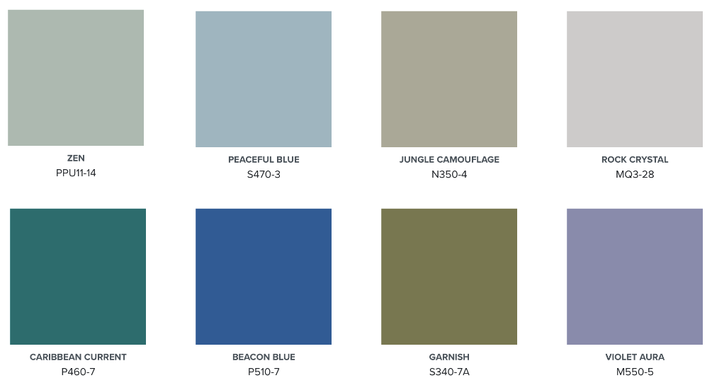
The top row of colors in the palette creates a calm and natural ambiance. These shades are soft and soothing, perfect for bringing a sense of tranquility and lightness to any room. They include gentle greens and blues, along with a cool grey that can serve as a versatile backdrop.
The bottom row introduces more vibrant and bold options. These hues are rich and dynamic, adding energy and depth to a space. They feature deeper blues, greens, and purples, offering a mix of striking and sophisticated choices for a stylish interior design.
Neutral vs Bold Comparisons
Zen vs. Caribbean Current – simple and tranquil compared to serene and confident.

The lighter option for this bedroom is painted with an accent of a nature-inspired neutral green hue, Zen. When surrounded by a soft white, the combination exudes simplicity and calmness. Stepping into this room feels like entering a tranquil haze, offering a peaceful and understated elegance.
The bolder version, painted in the rich teal hue of Caribbean Current creates a serene and confident atmosphere. The deep sea-inspired color wraps you in stillness, making it a perfect retreat for relaxation.
Peaceful Blue vs. Beacon Blue – open and inviting compared to warm and calm.
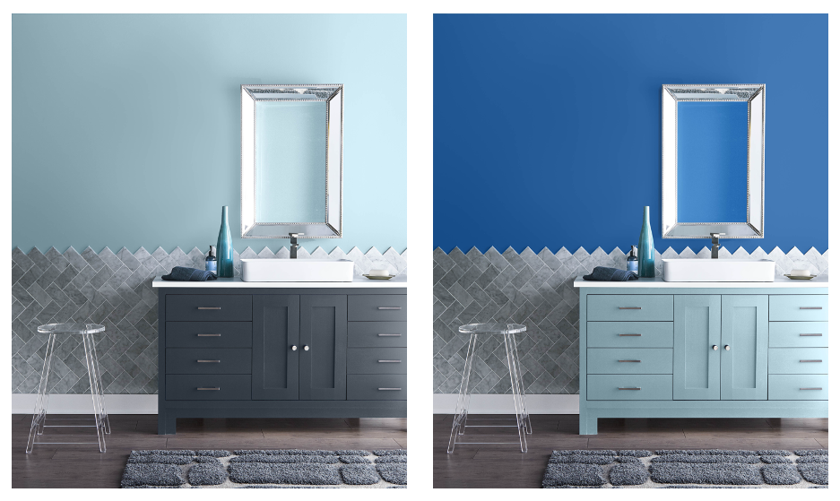
The combination of a quiet grayed-blue on the walls, mixed with a deep navy blue for the cabinet gives this contemporary bathroom a sophisticated design. Peaceful Blue draws you in, while the dark cabinet grounds the space. The room feels larger and more open, creating an inviting environment.
In contrast, the bathroom room, with its brilliant true blue wall color Beacon Blue gives the bathroom a bold modern vibe. The brighter tones create a warm, calm atmosphere that is perfect for a private space.
Jungle Camouflage vs. Garnish – relaxed and lively compared to warm and intimate.
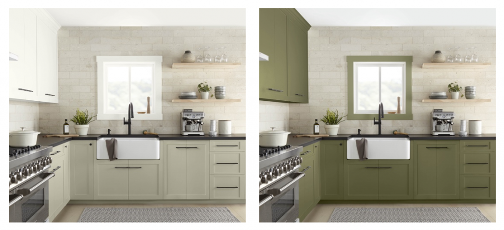
The two-toned cabinetry, with creamy white on the upper cabinets and a relaxed gray-green, Jungle Camouflage on the lower, creates a bright and open atmosphere in the kitchen. The light tones make the space feel large and inviting, perfect for a lively and welcoming environment.
When the cabinets are painted in a deep, shaded olive hue, Garnish, the kitchen becomes warm and intimate. The darker tone adds a touch of elegance and sophistication to the space.
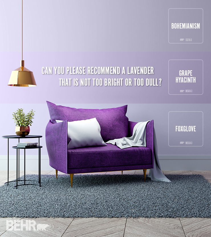
Rock Cystal vs. Violet Aura – open and calm compared to vibrant and cozy.
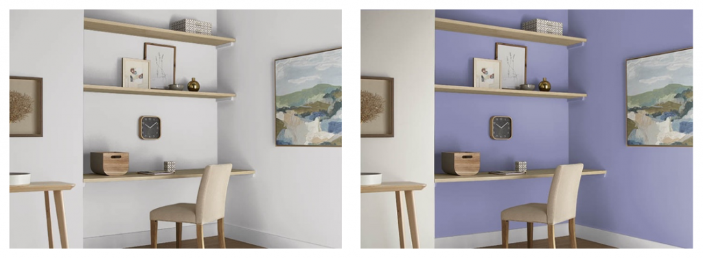
Using light grey in an office creates a bright and neutral atmosphere. Rock Crystal with its notes of lilac, makes the space feel open and calm, perfect for a focused and productive environment.
In contrast, Violet Aura adds a little mystery and refinement, stimulating the mind and encouraging imaginative play. It is a color of balance and free thought, bringing a more vibrant and cozier feel to the space.
Whether you choose neutral or bold colors for your walls, each option brings its unique feel to a room. Neutral colors can soothe and harmonize, while bold colors can energize and invigorate. The choice ultimately depends on the mood you want to create, and how you want to experience the space. So, when you’re ready to choose colors for your home, think about the emotional impact of color, and how it can transform your room into a place that truly reflects your style and needs.
For more inspiration and color options for your home visit behr.com.
Colorfully yours,
Larayne