Accent walls may have started off as a trend, but they’ve proven to have staying power through the years. They’re an easy way to add bold pops of color or pattern without overwhelming a space, not to mention adding a focal point to rooms that lack dimension. I even chatted about accent walls in my last post for April’s Color Clinic. If you’re looking to incorporate an accent wall in a new, striking, more creative way, just look up.
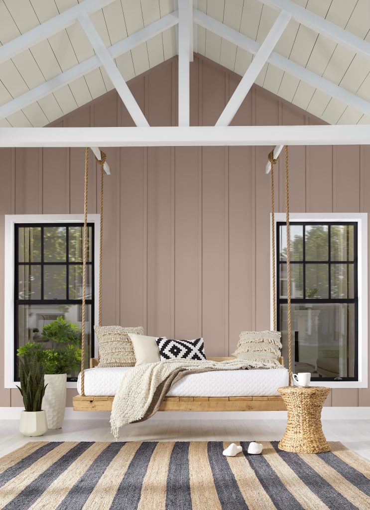
Our ceilings are an often neglected fifth wall that can add interest and dimension to your room. Coordinating the color of your ceiling with other furnishings in the space delivers a consistent look and feel. Or, pick a light or medium hue to add the illusion of space (and contrary to what you may have heard, in the right room, a dark ceiling can also open up an area, creating the appearance of a boundaryless space). If you want to create a sleek, streamlined and modern look, match your ceiling color with the other four walls in the room.
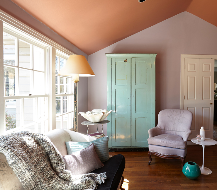
This living space is a fun example of how to use color to truly elevate and add depth to a room. Putting a light but still striking color like Mars Red PPU2-11 up above draws your focus to the angled ceiling. The large window lets in just enough natural light to make both colors flow together with an even amount of contrast. This gave me some inspiration for my own angled ceilings in a room that needed a little bit of love.
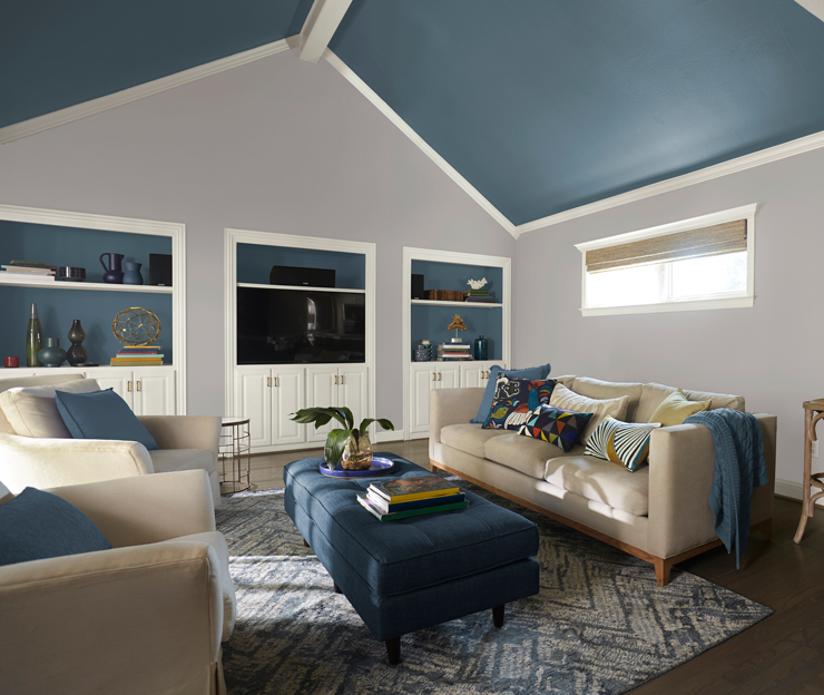
Behr’s 2019 Color of the Year, Blueprint S470-5, exudes a wonderfully serene feeling while adding depth to any wall. For this living room refresh, I wanted to make the angled ceilings stand out against the neutral Cotton Grey HDC-NT-20 walls and make the space feel a bit cozier. Putting a darker, contrasting color on my fifth wall makes the high ceilings appear slightly lower, while maintaining them as the focal point of the room. Also painting the built-in shelving with Blueprint and coordinating my accent furnishings creates a coherent and polished look.
For more color and design inspiration visit our Color Studio on behr.com.
Colorfully Yours,
Deanna

