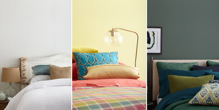
Thinking of a room refresh, but not quite sure where to start? Look no further! We’ve put together three trending looks with color, and design tips, to help you achieve the perfect look for the new year.
Look 1: Coast to Coast Coastal
Mood: Open, airy and calming.
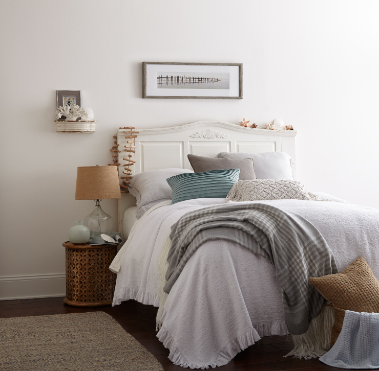
Walls and Trim: Polar Bear 75
Traditionally coastal styling was reflective of the tastes, colors an decor styles of specific coastal regions. California coastal looked very different from New England coastal, or that of coastal Florida. Coastal styling has evolved to become a homogeneous mixture of all coastal regions from north to south and east to west.
Color palettes are created by layering whites and off-whites with sun bleached pastels in warm and cool tones. Color accents are found in dusty aquas, nautical cobalts, rusty reds, warm stone grays and sandtones.
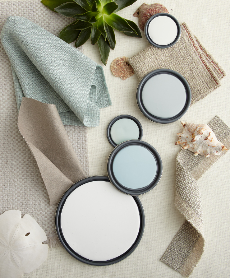
Colors featured (bottom to top): Polar Bear 75, Beach Foam S450-1, Melting Moment S430-1, Planetary Silver N460-2, White 52
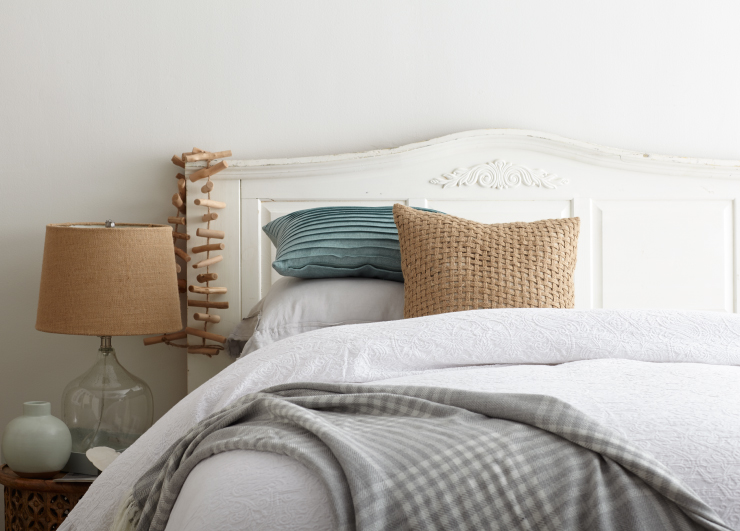
To create this style, look for natural weave rugs, decor in sand washed, salted, or powdered finishes, warm metals in brass and copper, and handwoven textures in fabrics and supporting decor. Mix weathered and worn furnishings with modern and organic accent pieces.
Look 2: Immersive Greens
Mood: Tranquil, contemplative, grounded.
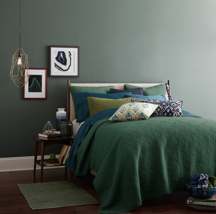
Wall: In The Woods T17-13, Trim: Ultra Pure White
The green family continues it’s renaissance with a strong presence at the forefront of fashion and design. Hues ranging from the deepest forests, aqueous blue-greens, true greens, silvery sages and tangy yellow-greens are mixed and matched across a myriad and patterns and styles.
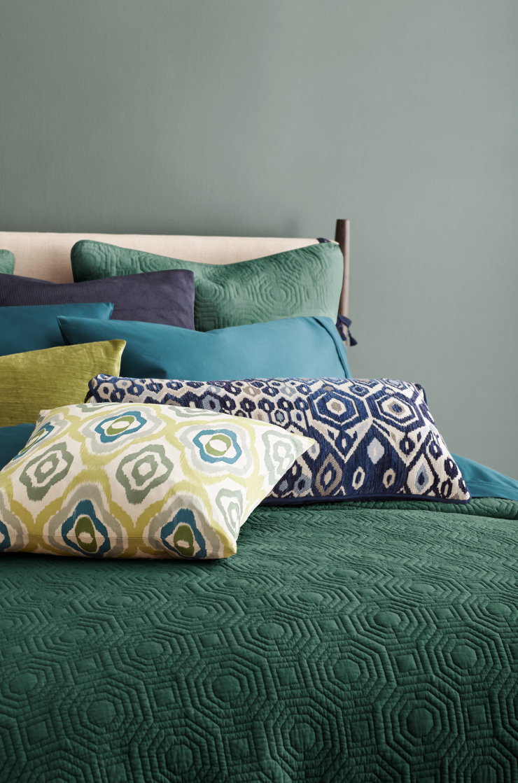
We find green transitioning from use as a supporting accent to a starring role. To create depth and interest the family is layered upon itself to create a monochromatic look, though with more variety in the green tones for a fresh take.
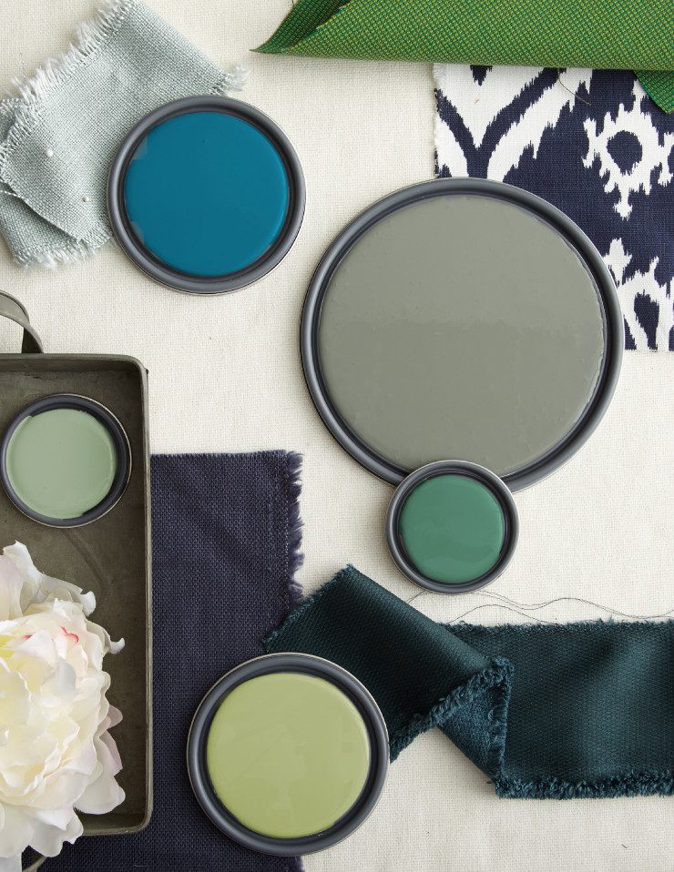
Colors featured (clockwise from top): Valley Of Glaciers M480-6, In The Woods T17-13, Park Bench M430-6, Sweet Grass M350-4, Jojoba N390-3
Creating this style is as easy as looking for green colored furnishings, fabrics and accessories and layering together. Stick to colors that have the same value, or lightness level, and accent with bright, light or deep variations.
Look 3: Spring Is In The Air
Mood: Cheery, energizing and youthful.
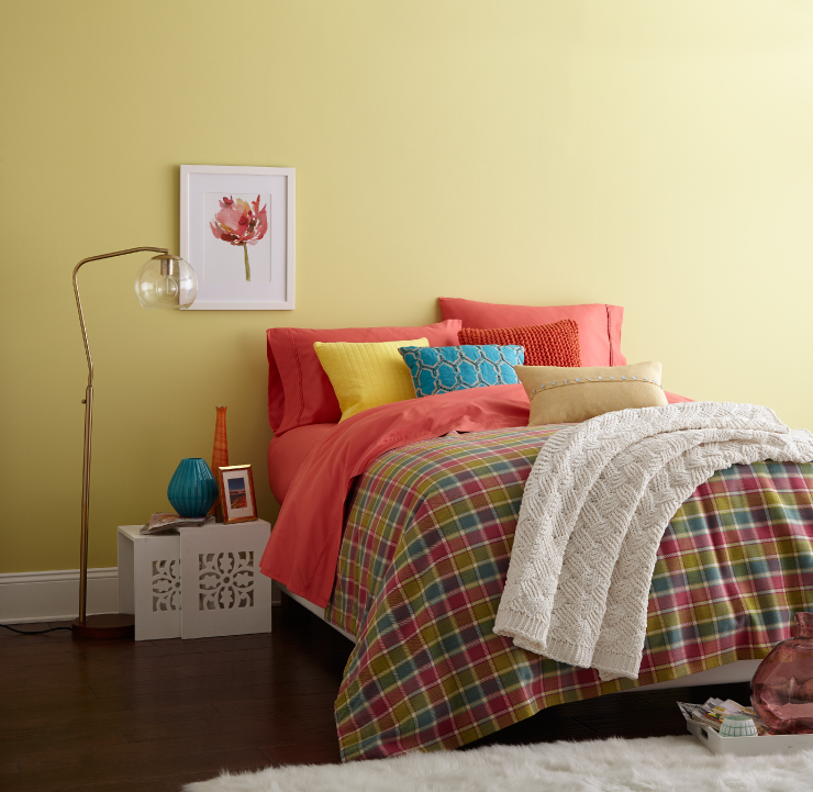
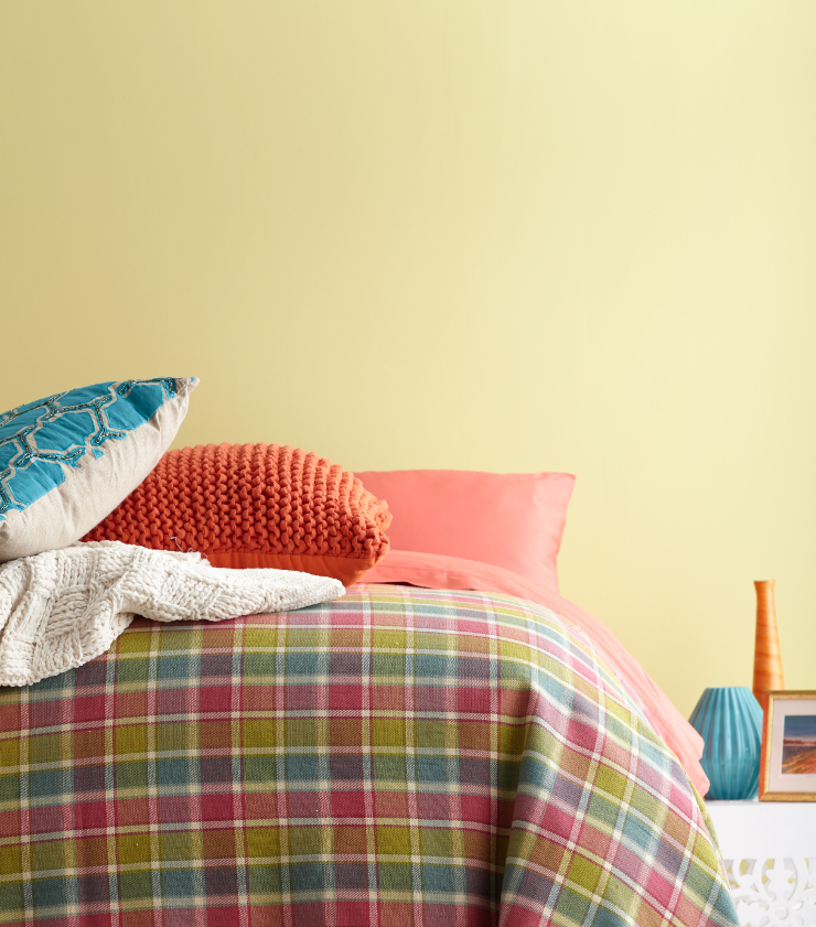
Walls: That’s My Lime T17-16, Trim: Ultra Pure White
There are those of us that thirst for excitement and energy, and seek to fill our rooms with vividness and color. If you fall into this category color is an essential element in establishing the mood and feeling for a space.
Color palettes for this look feature bright colors inspired by the floral and citrus brights of spring. Within them one can find fresh, yellow-greens, hot pinks, tropical blues mingled amidst soft pastels from every color family.
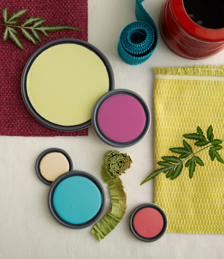
Featured colors (clockwise from top): That’s My Lime T17-16, Diva Glam P120-6, Pinkadelic P160-5, Placid Sea P470-5, Lunaria M280-2.
This look is all about accenting with brights, while balancing with white. Keep walls, fabric and decor items in brilliant, energy inducing, tones and furnishings, trim and flooring in white. Using white in this way, supports vivid color use by allowing a place for they eye to rest.
To see how any of these colors would look in your own space click here.
Colorfully yours,
-Quinn


My duplex is small and needs pizzas. I want a wall color for the entryway that feels welcoming and says welcome. I want it to feel welconing.
Hello Vivien,
Thank you for visiting our blog!
We will recommend the following hues for your foyer – Spinning Silk YL-W01, Minestrone S200-5, Shiitake N220-4, Terra Cotta Clay M200-5, or Summerwood S290-4.
Due to differences in monitors and technical factors, the colors here cannot be represented with
their true qualities. These color samples should only be considered a guide. Please refer to actual swatches for true color. We strongly recommend beginning with an 8 oz. sample container of the color you choose and apply it to a small area on your wall to ensure your satisfaction with the color choice. It is always a good idea to see how the light and ambient conditions affect the color at different points in the day.
Colorfully Yours,
Deanna
I have to paint 3 bedrooms. What color or colors are being used for ceilings these days?? Is it still the traditional white?
Hello Mark,
Thank you for visiting our blog!
For ceilings yes it is the traditional white color that is still popular. We will recommend Ultra Pure White, Polar Bear 75 and Swiss Coffee 12.
Due to differences in monitors and technical factors, the colors here cannot be represented with
their true qualities. These color samples should only be considered a guide. Please refer to actual swatches for true color. We strongly recommend beginning with an 8 oz. sample container of the color you choose and apply it to a small area on your wall to ensure your satisfaction with the color choice. It is always a good idea to see how the light and ambient conditions affect the color at different points in the day.
Colorfully Yours,
Deanna